Sites Preview On Mobile
No URL tested, please input your domain above!
Learn how to use this tools?

Audit Information
A metric that measures how quickly and efficiently a website loads and functions on mobile devices. This score is based on the First Contentful Paint (FCP), Largest Contentful Paint (LCP), Cumulative Layout Shift (CLS), Total Blocking Time (TBT) and Speed Index metrics.
Testing a web page by emulating mobile device usage conditions, provides an idea of how well the web is optimized for mobile devices based on factors such as: Screen Resolution, Network Speed, and CPU and RAM Performance.
Page loading checks
Page loading issues
Currently, with the latest version of the Mobile-Friendly tool, users can use our additional feature, namely the Robot Progress Bar, and see a website that can be checked by mobile. The Robot Progress Bar is useful for seeing the percentage of crawled processes. While other additional features provide the advantage to preview more detail during the website builder.
Our robot is resting.
Ready to give it a task?

Currently, with the latest version of the Mobile-Friendly tool, users can use our additional feature, namely the Robot Progress Bar, and see a website that can be checked by mobile. The Robot Progress Bar is useful for seeing the percentage of crawled processes. While other additional features provide the advantage to preview more detail during the website builder.
What's New
Last update Oct 13, 2023
30 Tools for Countless Solutions! cmlabs has reached a remarkable milestone with the release of 30 cutting-edge tools designed to empower businesses and individuals in the digital realm. All 30 tools, from Test & Checker, Sitemap.XML, and Robots.TXT to various JSON-LD Schema Generator, have been launched to address specific needs and challenges across diverse industries. Together with cmlabs tools, you can stand at the forefront of technological advancements. Try our tools based on your needs now!
Notification centerSEO Services
Get a personalized SEO service and give your business a treat.
Digital Media Buying
Get a personalized SEO service and give your business a treat.
SEO Content Writing
Get a personalized SEO service and give your business a treat.
SEO Political Campaign
Get a personalized SEO service and give your business a treat.
Backlink Services
Get a personalized SEO service and give your business a treat.
Other SEO Tools
Broaden your SEO knowledge
Free on all Chromium-based web browsers


Mobile-Friendly Test
Mobile-friendly test is one of the free SEO tools provided by cmlabs. This tool functions to test the mobile-friendliness of a URL from a website. By entering the website address into the box provided, you can find out how well the website is on a mobile display.
In recent years, Google has determined that all websites must be mobile-first. This is due to the growing number of mobile users from time to time.
Therefore, as a website owner, you must ensure that your website is mobile-friendly, responsive on all devices, and provides a good user experience so that it can occupy a high position on search results pages.
If the Mobile-Friendly Test tool cannot open the page, an error will appear explaining the problem. Access issues include system availability or site downtime.
This Mobile-Friendly Test tool opens the page as Googlebot (not using your data, but as Google). Because of this, it will most likely be blocked by a robots.txt document.
If the test is unable to mount all the elements used on the page, you will get a notification. Resources are external components included by the page, for example, images, CSS, or script files. This can happen for several reasons:
If you have elements that won't load or other pile-up issues, you may see slightly different results each time you run your test. That's because the stacked resource settings can be different during testing.
As previously stated, having a mobile-friendly website page is a must if you want to achieve high rankings. The following is a list of advantages of having a mobile-friendly website:
Now that you know the importance of having a mobile-friendly website, then how do you make the page mobile-friendly? Here are some tips to improve the mobile-friendliness of a website.
Of course, the appearance of the website on mobile and desktop will be different due to different screen sizes. Therefore, your website should have a responsive display which means it should be able to display well on various screen sizes.
By adjusting the appearance of the website, your website will automatically become mobile-friendly. Consistent display between desktop and mobile screens is very important for visitors’ convenience
AMP (accelerated mobile page) is a framework that was launched to create a simple mobile website and make the page more accessible by reducing some elements that are considered heavy. By using this technology, the website speed will increase and it will be more mobile-friendly.
In addition to using AMP to increase page speed, you can reduce unnecessary elements that can hinder the page loading process. For a more complete explanation, read also how to increase website loading speed.
Visual elements such as images must be optimized because these elements contribute to the loading time of a website. You can set the format, compress the image, and add alt-text to the image.
The display or UI we mean includes the use of fonts, simple forms, and pop-ups on web pages. These elements must be optimized on mobile devices with limited screen sizes so as not to affect the overall appearance of the website.
Thus a discussion of the Mobile-friendly test tool from cmlabs complete with benefits and how to optimize it. Visit this tool page to start testing your website for free.
We have summarized the steps you must take to operate this tool. Read more below.
As the main step, of course, you have to open the page of this tool. After that, you will see several available features such as the URL column, display of results, checking progress, mobile preview, history, to a brief explanation of this tool.
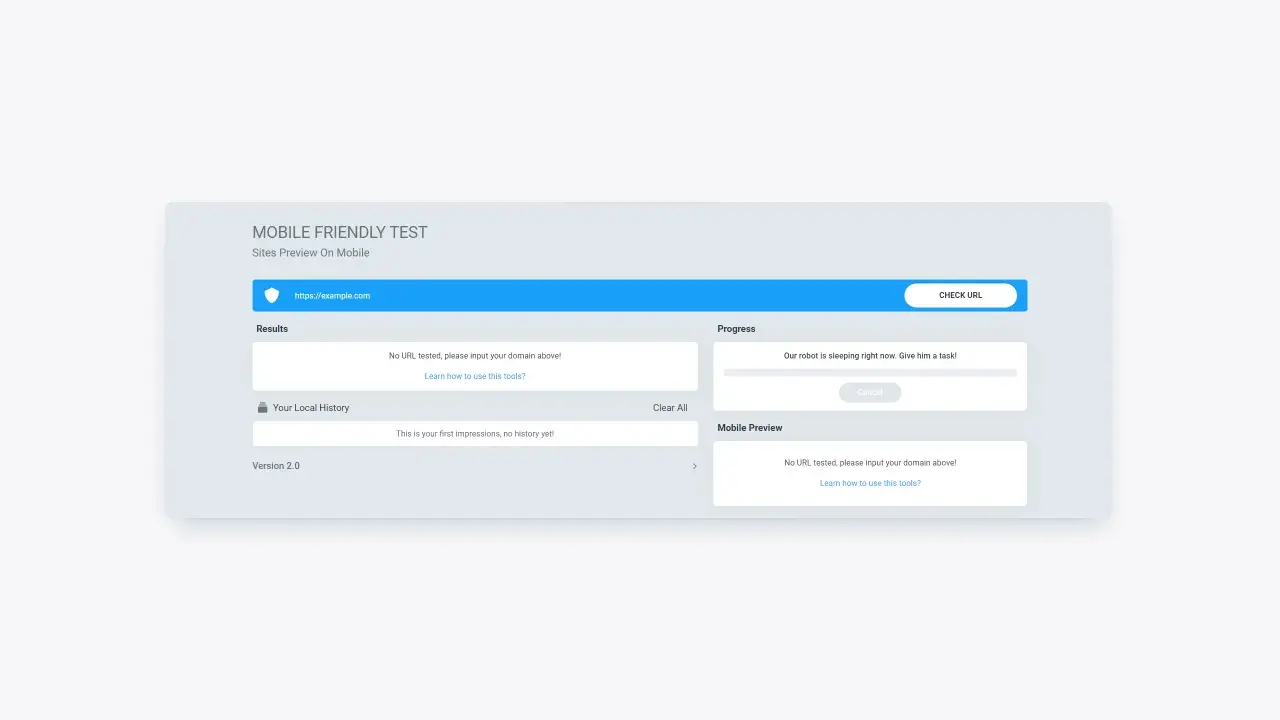
Figure 1: Mobile-friendly test page display from cmlabs
You must first enter the website URL in the field provided. Make sure you have entered the URL in the correct format (e.g https://example.com). Next, click the "Check URL" button to give the command to this tool to start checking the website.
Figure 2: How to enter a website URL to check for mobile-friendliness
After you click the Check URL button, you will wait a while for the robot to check. You can see the progress in the progress bar below the URL field. This process does not take much time, you can immediately find out in the results field on the left side of the page.
The results page will display the mobile-friendliness status of the URL you entered along with any issues found if any.
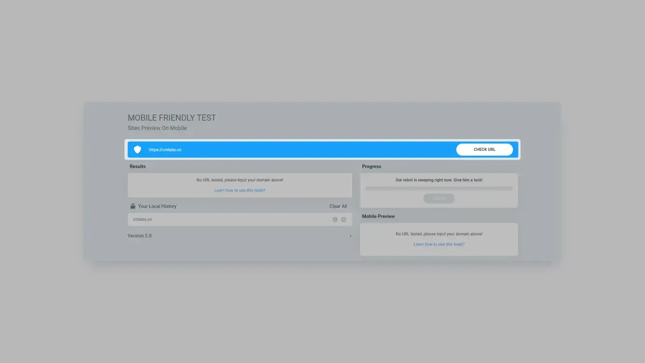
Figure 3: Mobile-friendly check results from previously entered URLs.
In addition to displaying mobile-friendliness results, you can also see how the website will look when accessed via mobile. This feature allows you to analyze the UI/UX appearance of the mobile view.
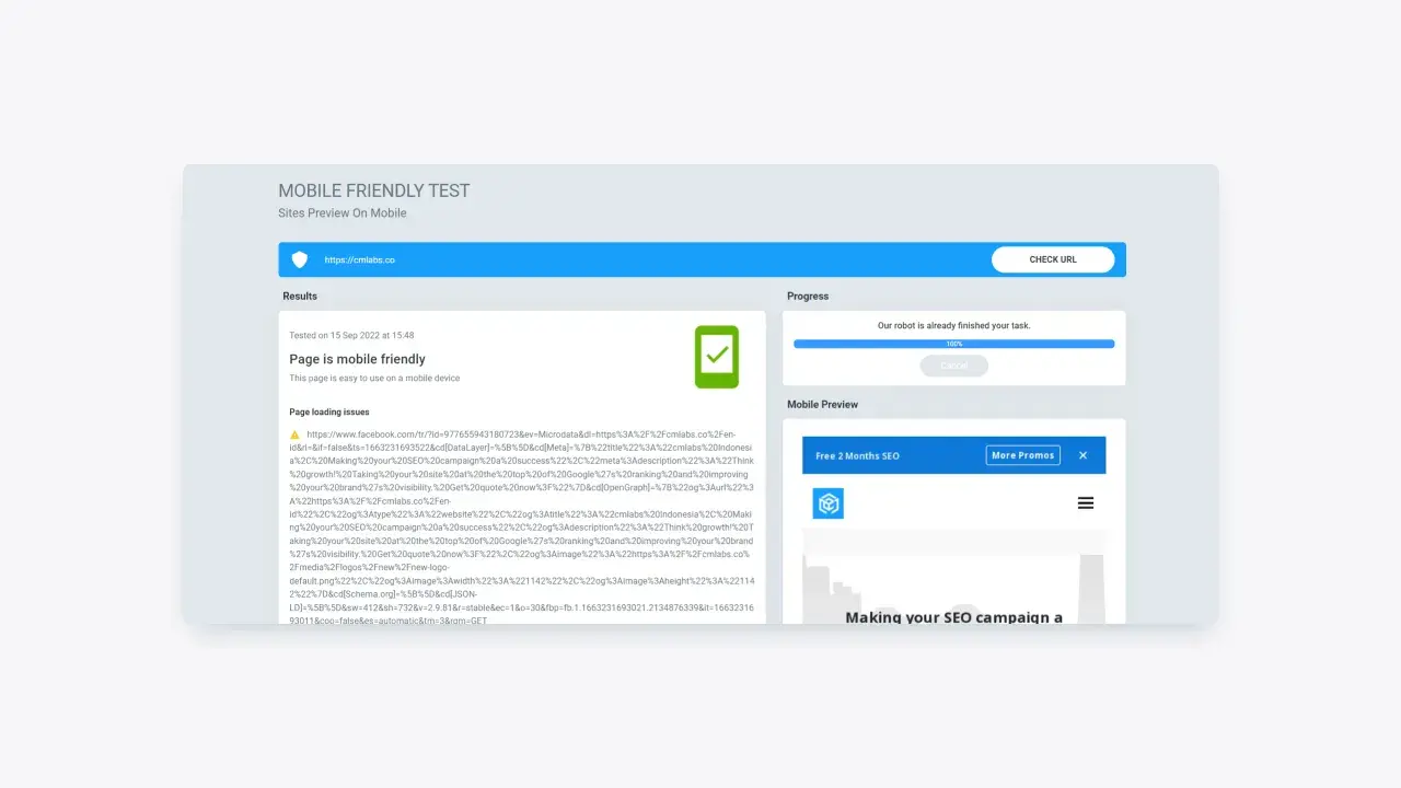
Figure 4: Mobile preview feature on Mobile-Friendly test
The last thing you can do using the Mobile-Friendly Test is look at your history of using the tool. This tool allows you to view all URL history that has been checked using this tool.
With this feature, you don't need to re-type the URL that was checked if you want to re-check it. You can also delete usage history using the "Clear" button on the right side of the usage history feature.
Figure 5: History feature of the Mobile-Friendly Test tool from cmlabs
Some cmlabs free tools require a login process after 5 times of use, Mobile-friendly Test is one of them. If you have used it 5 times, our system will automatically display a message stating that you have reached the usage limit.
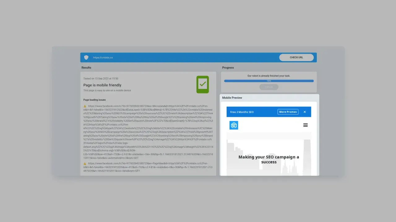
Figure 6: The usage warning. In this warning, there is a login button that directs to the login page.
You can log in by clicking the login button on the warning message that appears. Next, you will be directed to the cmlabs login page. Please enter the required data, or you can log in via Google.
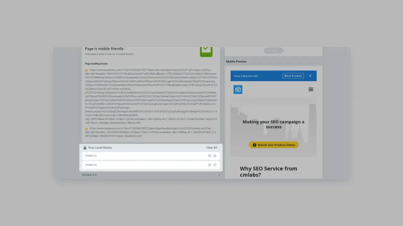
Figure 7: cmlabs login page
Once you have successfully logged in, you will be able to return to using the tool to check for mobile-friendliness for free. By logging in, the system can save historical data on the use of this tool in the last a year.
Read More
Edited at Oct 13, 2023
The Search Engine Optimization (SEO) Starter Guide provides best practices to make it easier for search engines to crawl, index, and understand your content.

Jakarta, Indonesia (HQ)
cmlabs Jakarta HQ Jl. Pluit Kencana Raya No.63, Pluit, Penjaringan, Jakarta Utara, DKI Jakarta, 14450, Indonesia
(+62) 21-666-04470These strategic alliances allow us to offer our clients a wider range of SEO innovative solutions and exceptional service.
Psst! Hey there, SEO Stats and Tools SEO company! If you've ever planned of conquering the Indonesian market, you've come to the right place!

These strategic alliances allow us to offer our clients a wider range of SEO innovative solutions and exceptional service.
Psst! Hey there, SEO Stats and Tools SEO company! If you've ever planned of conquering the Indonesian market, you've come to the right place!